Examples
Examples: three real conversions, before and after
Numbers speak louder than promises, so here are three files we made ourselves and converted with CMYKflow, using the same settings the site uses. For each one you can see the design, the ink figures and the four ink plates, for Convert to CMYK and for Safer for press at Medium.
How we made and measured them
All three designs were drawn from scratch: no design-tool templates, no stock photos (the “photos” are generated patterns), standard fonts. They were saved as RGB PDFs without a color profile, which is how some design tools export. Each PDF was converted twice with CMYKflow’s converter: once with Convert to CMYK and once with Safer for press at Medium (without Deeper blacks).
Two numbers are given for each version:
- Average ink: the ink figure CMYKflow shows for every version, the average total of cyan, magenta, yellow and black over the whole page.
- Darkest point: the highest total of the four inks anywhere on the page. This is the number printers mean by an ink limit.
“Original” is the RGB file as CMYKflow’s ink check measures it before conversion.
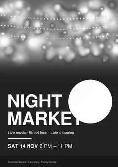
1. Night-market poster
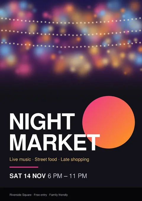
| Version | Average ink | Darkest point |
|---|---|---|
| Original (RGB) | 223% | — |
| Convert to CMYK | 218% | 310% |
| Safer for press, Medium | 186% | 271% |
This is the classic problem file: a large near-black background. After a plain conversion the background is a four-ink black of about 80% cyan, 71% magenta, 51% yellow and 87% black (290%). Safer for press moves it to about 58/49/27/94 (228%). On average, the Safer version uses 14.9% less ink than the plain CMYK version of the same poster. The pink and orange of the circle and the yellow subtitle are practically unchanged.
Ink plates, Convert to CMYK
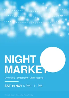
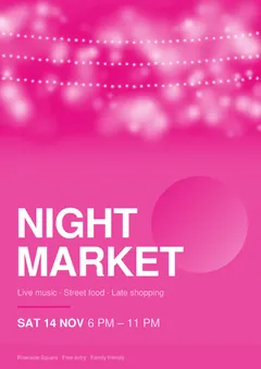
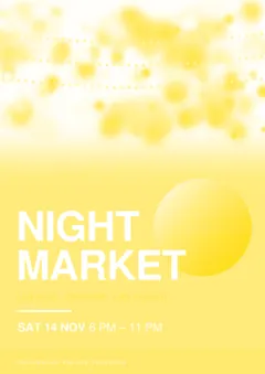
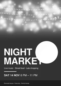
Ink plates, Safer for press (Medium)
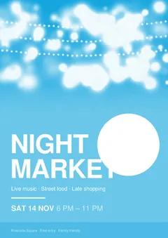
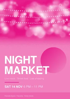
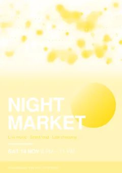
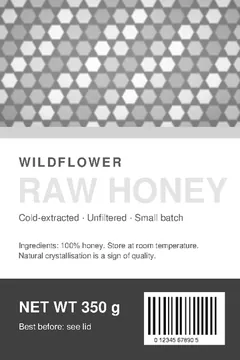
2. Honey jar label

| Version | Average ink | Darkest point |
|---|---|---|
| Original (RGB) | 144% | — |
| Convert to CMYK | 135% | 276% |
| Safer for press, Medium | 124% | 230% |
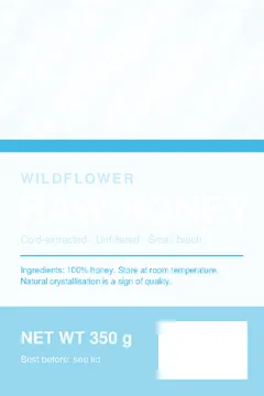
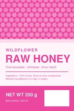
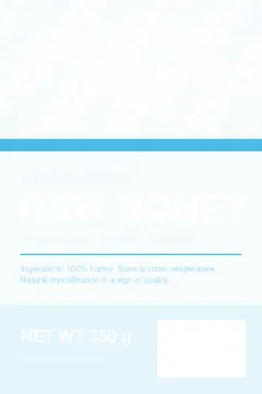
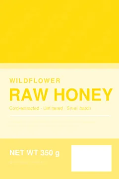
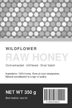
Most of this label is light or brightly colored, so the average changes less: 8.1% less ink than the plain CMYK version. The dark brown panel is where it matters: it goes from about 74/66/62/73 (276%) to 33/28/22/91 (174%). The bright orange headline and the purple rule keep the same values in both versions (differences below 0.1%), and the pure black barcode and digits are black ink only in both.
Ink plates, Convert to CMYK
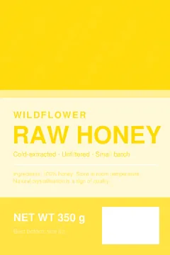
Ink plates, Safer for press (Medium)

3. Business card

| Version | Average ink | Darkest point |
|---|---|---|
| Original (RGB) | 248% | — |
| Convert to CMYK | 219% | 256% |
| Safer for press, Medium | 196% | 238% |
A dark card with a colored background: 10.3% less ink on average than the plain CMYK version. The navy changes less than a near-black, probably because black ink can only replace the gray part of a color and a strongly colored navy has less of it. The coral accent and the light text keep their values (differences below 0.1%).
Ink plates, Convert to CMYK




Ink plates, Safer for press (Medium)




What the examples show
- The darker the design, the bigger the effect. The near-black poster and the brown panel changed most.
- Bright colors stay. Orange, pink, purple and coral kept their values or changed by a fraction of a percent.
- Pure black text stays black ink only. The barcode and its digits stayed on the black plate.
- The plain conversion is already capped. Convert to CMYK kept every converted color at or below 320% total ink; the poster’s darkest point was 310%.
Your own file will give its own numbers. CMYKflow shows them, with a free preview and the ink plates, before you download. More background in Printing large dark backgrounds and Rich black vs plain black.
Frequently asked questions
Were these designs made with a design-tool template?
No. We drew all three from scratch, with generated images and no third-party photos, and saved them as RGB PDFs without color profiles, which is how some design tools export.
Will my file save the same amount of ink?
No. The saving depends on how much dark and neutral color your design has. A design that is mostly bright colors on white changes very little; a dark poster changes a lot. CMYKflow shows the ink figures for your own file before you download.
How were the numbers measured?
The average figures are CMYKflow’s own ink figures: the average ink over the page for cyan, magenta, yellow and black added together. The darkest point is the highest total of the four inks found anywhere on the page, measured on a 150 dpi rendering of each PDF.